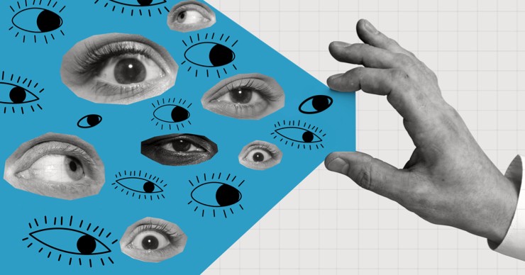
WHERE & HOW To Look For UX Inspiration

The bunch shortlisted should be diverse in the terms of product content, representation, how and where features appear in the user flow. It’s quite common to make mistakes and overlook crucial details. Here is how we go about fishing for unusual references which actually add value to the project and save us some crucial time:
- Top Design Sites Can Be More UI, Less UX
You’ve obviously scrolled Behance, Dribble, Pinterest, Devian Art & others for inspiration, but are they the most appropriate for UX references? Maybe not. They mostly get you allured to interfaces with high visual appeal (fancy animations, trendy layouts, etc) & may distract you from analyzing user experience.
On a good search, they do have good references with content and aesthetics both, but these references are more often indirect.
- Scan Your Direct Competition Thoroughly
List competitors & companies from the same industry & give their products / mobile applications a thorough scan. They would have the most relevant screen designs in terms of content and functionality, since these companies cater to very similar target audiences. This will also give you an understanding of Trending & Functional designs your users are adaptive too.
Pro-Tip: Also look for industries that incorporate similar features to that of your app & then consider relevant companies belonging to those industries that have advanced in those areas.
- Competitor Product Videos Are A True Summary
Are you just referencing the basic play store/app store screenshots? Stop. They do not provide all screens that make up the application & sometimes they are very demo-like, highlighting key features only. It’s difficult to interpret the flow of the app too. Similarly, downloading the app may not be enough as it’s possible to miss out on a few key user flows. Hence, keep product marketing videos handy. They mostly
walk you through the entire flow, giving tutorials on how the app actually works. All this will help you gather more information and inspiration for the app you are designing.
- Not Just Screens, Review their Product Marketing
Apart from the mediums mentioned above, another very useful source is social media. The pages of the companies have posts uploaded which essentially explain the features and the use of their product to market themselves. Pictures and screenshots of their app screens are also easily found on their profiles. This is an easy way of gathering references.
Here are some bonus tips for Collecting References:
- Save It All – References
Whenever you come across references which you think might not be as relevant as you want them to be, save them. You never know when and how you might need those in the future. Often, you ignore screens with little relevance and then struggle to find them later, for another task. By the time you realised you needed them, you had already forgotten where and when you had seen them. Don’t make that mistake save, always (in an organized folder please.) Inspiration has infinite value in any creative work.
- Get Filtering
After saving them up, start your filtering process. Mind you, it’s even more intense and time consuming than searching for references. We generally set a filter guide first & then scan the options with a calm mind. A big no no is to start saving more references while filtering, it just kills the process & your concentration.
Conclusion:
All in all, finding references from the right places in the right way ends up saving a lot of time and effort. Following these tips have helped us achieve our goals and satisfy the requirements of the clients in the most optimal way. There are endless resources available to find references, but there are only limited resources that help you gather what will really help you and work as a guiding force in the execution phase.

-
Designcoz
UI/UX Design Partner
We are a process-driven agency based out of India building impactful Digital products for ambitious companies from around the world. Chaos is our raw material & problem solving is in our DNA.


0 Comments